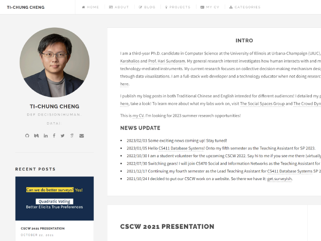
Why a redesign?

Table of Contents
Issues with the old site #
My earliest website was written in plain old HTML, CSS, and JavaScript during my sophomore year. Over the years, I have tried different rendering methods and frameworks. In the winter of 2017, I decided to switch to Hugo because I wanted something that I could customize to some degree but also simple enough to generate content using Markdown. Back then, I was obsessed with Hackpad (which was acquired by Dropbox and now rebranded as Dropbox Paper), and I thought that much of the content could be ported directly from my old notes. During that period, I was applying to graduate school, and I wanted to use the website to introduce myself to others. I was genuinely happy with the results.
Five years had passed, and there is a huge problem that I face whenever I update this website – what language should I write X in? From the very beginning this site serves two purposes: a gateway to introduce myself to others, and also a place to publish notes. I wanted the contents about me, and my work to be in English, so that it is accessible to the international community. At the same time, I see little content written in Traditional Chinese in HCI, CSCW and things that I research on. And thus, I wanted to craft my notes and explanations in Traditional Chinese. The result is not good. I have a stream of posts mixed with two languages. I have to tell people that do not read English where a specific post is. And I think asking non-Chinese speakers to use this website is a bit too much. Overall, it is a poor UX experience.
The author of the original theme that I but the website on stopped maintaining. This means that I would not be able to use the new Hugo features. The Google Analytics also stopped working because the scripts are now different. I wanted a better search function and maybe some other handy features, but I could not do that. The community made a fork of the theme, but I did not like some of the changes. I really thank the original author in providing a great theme, but I think it is time to move on.
The new site #
The trigger to shift to this new site is not because of all the above reasons. They were issues that I knew but just didn’t have enough momentum and time to fix. The last straw was the cover photo of this website. I was playing with Midjourney and I wanted to generate a cute image that represents what I am researching. After multiple iterations, I came up with that image – to represent the core of human, robot, computers sitting together and making decisions – that I like. However, I just can’t get it to fit into the old website. I decided to carve out one night during spring break to do a proof of concept to see if a new site is possible. I was able to get language issues resolved and writing partials to make the site more modular is not that hard. I was happy with the result, and I decided to go all in.
i18n #

i18n is short for Internationalization. The new site will now show two “tags” to the right of the Title. Whenever you visit a page that has both buttons, that usually means that the page is available in both languages. I am still working on porting and translating some of the content that I want both language-speaking audiences to see, but it is heading in the right direction. I can now intentionally write both contents not as direct translations, but as two different ways of explaining the same thing since they are intended for different audiences.
Search and Table of Contents #
The new theme supports search (via the top right search icon) and posts now support a table of content for fast access to different sections!
Maintainability #
In the previous setup, since I was new to Hugo, I actually overwritten the theme submodule with my own changes. This makes it extremely hard to update the theme (when it is still updateable). Also, static contents were placed all over the place, and I ended up hardcoding a lot of things including writing a lot of HTML in markdown. After reviewing the documents and the experiences I gained in the past few years, I reorganized many of the contents. Let’s hope that I can keep it this way.
Projects & Accessibility #
Moving forward, there are two things that I plan to work on. First, I want to think of a better way to present my projects. I want my research and software deliverables to put together like a portfolio, but I also want it to be a place where I can record my motivations and how I navigate through community projects. This would probably take some time, but let’s leave it as is. Second, I want to make this website more accessible. I would need some time to investigate how I can port some basic accessibility packages to Hugo.
Conclusion #
So that’s a short wrap-up of the new site. Let me know how you like it!