Quadratic Surveys
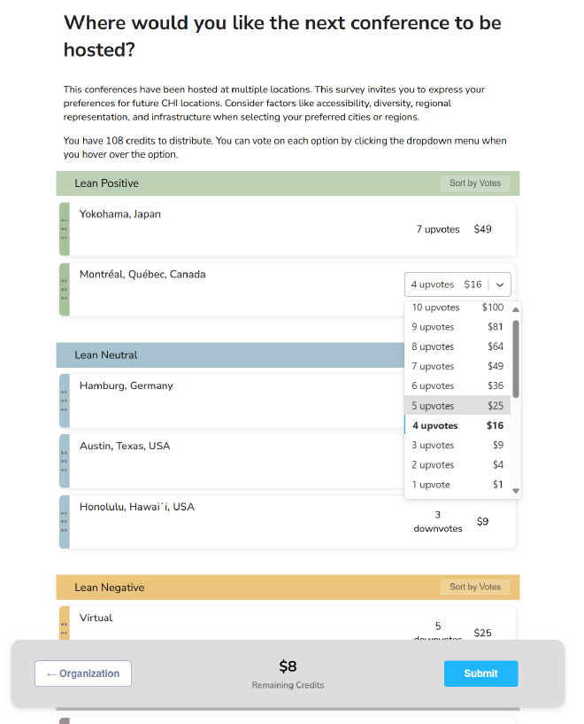
Table of Contents
At a Glance #
Quadratic Survey (QS) captures not only what people prefer across many options, but how much they care. In or analysis, QS produced 70% pairwise ranking alignment with behavioral donations versus 59% for Likert (+11pp, ≈ +18.6% relative). Across moderate differences between option preferences, QS quantified intensity about twice as well as Likert. A two-phase Organize-then-Vote interface keeps helps scaffold preference construction process, taming cognitive load while preserving reliability.
I led the work end-to-end: theory → design → engineering → evaluation as the core of my dissertation since 2020.

Why QS should Exist #
Resource allocation and prioritization are critical from governments to companies to individuals. Preference strength across multiple competing matters to decision makers and researcher in making informed choices. However, traditional single-item ratings, like the common Likert scale survey, make people answer in a binary mindset and hide trade-offs. The result is mis-ranked options and brittle “strong” preferences that distorts nuance preferences. My question was simple: how can we design a digital tool that elicits nuanced individual preferences across multiple options?
How QS works #
Mechanism. Each respondent receives a fixed credit budget to allocate across survey options with a quadratic cost per additional vote (1, 4, 9, 16, …). Spending heavily on one option consumes credits quickly. Individuals can express support or opposition on each option via multiple upvotes and downvotes. The survey outcome is the sum of votes across individuals.
Interface. QS is intentionally more thoughtful than clicking through Likert items. To scaffold the process, I designed Organize-then-Vote:
- Organize: place items into Lean Positive / Neutral / Lean Negative categories. Participants can easily reassign the groups while seeing the whole landscape.
- Vote: allocate credits with a dropdown that shows the votes to place, quadratic cost and remaining credits making trade-offs visible at the moment of choice.
What I Did #
I set the research vision and problem framing; translated the mechanism into a usable workflow; built the survey platform and study instrumentation; and ran mix-method analyses (including Bayesian models). This research produced 1 public working prototype, 3 papers, 1 poster, 2 datasets, multiple notebooks. Datasets and notebooks are linked from the papers below.
Who Should Care #
- Practitioners and researchers. When surveys inform action, QS surfaces real trade-offs instead of flattened scores.
- CX/UX designers. Interface is cognitive design. The two-phase flow reduces reactive answering and supports deliberate allocation.
- Anyone facing complex choices. Apparent indecision is often legitimate complexity. QS helps people form—and then communicate—coherent preferences.
Evaluation #
I ran multiple studies over several years. Two core studies: (1) an alignment study that compares stated vs. revealed preferences, and (2) an interface study that tested whether design can limit cognitive cost without breaking the mechanism.
Alignment Study: Do survey signals match behavior? #
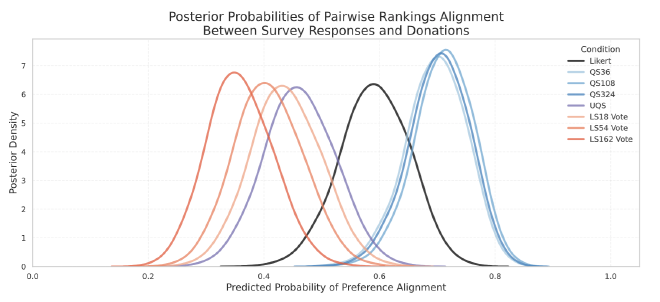
I designed a between-subject study where 421 participants completed one of several survey mechanisms (Likert, QS, Constant-Sum / linear chips) and then made incentive-compatible donations. I fit Bayesian models to compare pairwise ranking alignment (does expressing A > B on the survey match higher donations on A?) and intensity alignment (when A is strongly preferred to B, is the difference between A and B donation’s gap larger?).
Findings. QS matched donation choices about 70% of the time, versus 59% for Likert and ≈45% for Constant Sum. At moderate differences between options, QS tracked intensity ~2× better than Likert and outperformed typical constant sum surveys. As differences grew, QS better reflected the widening gap.
Interface Study — Can design tame the cognitive burden? #
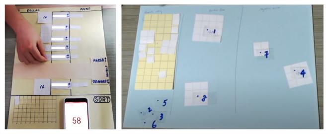
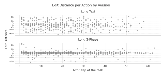
I conducted a within-subject in-lab study that compared a text-only QS UI against Organize-then-Vote, crossing 6 vs. 24 options. Measures included weighted NASA-TLX, clickstream structure (with hierarchical Bayesian models), and contextual interviews.
Findings. Organize-then-Vote reduced cognitive load on short lists and improved engagement on long lists. People traversed the list less but spent more time per option; edit patterns concentrated at the start and finish rather than frantic mid-task tweaking—evidence of more strategic allocation.
Decisions and Guidance #
Adopt QS when preference strength affects outcomes across many items (prioritization, selection, budgeting). Ship Organize-then-Vote as the default; it delivers the mechanism’s benefits with limited cognitive cost. Avoid long, text-only QS forms that push respondents into mechanical tweaking. Long QS requires time. Plan sessions so respondents can think, not rush.
What’s Next #
Two threads continue:
- Analysis & visualization. QS produces richer signals than single-item scales; I am building interactive visualizations that make collective intensity legible for decision-makers.
- Group decisions. Teams need to reconcile individual strength-of-preference. I am prototyping workflows that surface conflicts and converge on durable choices.
Related Links and Resources #
- qsurvey.online — public prototype
- CSCW 2021 paper: “I can show what I really like.” Eliciting Preferences via Quadratic Voting — initial validation that QS outperforms Likert
- CHI 2025 paper: Organize, Then Vote: Exploring Cognitive Load in Quadratic Survey Interfaces — design and validation of the Organize-then-Vote interface
- CI 2025 paper: Budget, Cost, or Both? An Empirical Exploration of Mechanisms in Quadratic Surveys — in-depth analysis of QS mechanism components compared with Likert and chip-allocation baselines
- CI 2025 poster: Understanding Quadratic Survey Results: Interactive Visualization for Collective Insights — visualization dashboard for QS results
- Datasets and analysis notebooks can be obtained from the papers.