Data analysis from Movie Dataset
目錄
Introduction #
This is a demo for data analysis using Python.
According to estimation by Statista[1], the number of digital cinema screens has grown from 2,500 to 150,000 over the past ten years. With the rise of information technology, we are also capable of storing and retrieve movie viewer’s information and their reviews. Leveraging the computing power today, it is now possible to derive insights from these datasets. In this report, I would look at the given dataset from a pure analysis perspective and also results from machine learning methods.
This dataset is provided by Grouplens[2], a research lab at the University of Minnesota, extracted from the movie website, MovieLens[3]. The dataset contains over 20 million ratings across 27278 movies. Dataset comes from 138493 users between January 09, 1995 and March 31, 2015[4]. In this report, only two datasets involving movie data and user ratings were used.
Given the dataset, I aim to answer two questions regarding movie production and user clusters respectively:
- Is the number of movies produced affected by user ratings from the previous years or the number of views from the viewers? - Can I identify viewer clusters and find similar groups of viewers?
1 Analysis through observation #
Data Cleaning
By observing the movie data (movies.csv), example shown below, the three columns include movie_id, title, and genre. In the names category, the year the movie was produced are in parenthesis; the genre is concatenated as a string separated by |.
131248, Brother Bear 2 (2006), Adventure|Animation|Children|Comedy|Fantasy
The data would be reorganized into a sparse matrix with years id and categories. The number of Category items depends on the given data and are not explicitly defined. Part of this data can be demo below
Together with rating information, the new data for each cell comes by multiply the rating with the entire row. By grouping all the dataset by year, two tables can be created, namely: Number of films per category per year and ratings per category per year.
Data Plotting and Analysis
With this, each category can be plotted. Each of these images contains 4 different line:
- Production (Blue) : number of films produced under this category in the given year
- Score(Green) : the average score of all films within the category given year
- Views(Red) : the number of views of all films within the category given year
- AvgViews(Purple) : the average number of views for one single film within this category given year
Here, I present some of the results.
| Action | Comedy |
|---|---|
 |  |
| Drama | War |
|---|---|
 |  |
| Total |
|---|
 |
By observing the rating and the production amount, little relationship can be found. It is true that a shift from the rating (green) ahead of the production (blue) occurs, but only in segments within the graphs, not in general. The reason behind that could most likely be that the views of a particular movie might not be right after the release of the movies. The causal effects are low and cannot make an inference from this set of observation. Second of all, the ratings do not differ much if we look closely at the scale. To be exact, the range between half a star should not affect the production of movies. However, I found two interesting questions from these graphs. Why are the viewing metrics falling while production grow? What are the peaks in the data? By using moving average to remove the concussion from the data, the same five graphs are re-plotted.
| Action | Comedy |
|---|---|
 |  |
| Drama | War |
|---|---|
 |  |
| Total |
|---|
 |
Again, by rescaling the rating attribute, there is almost no change over the course of time. The ratings are also similar across the span of a genre. With the rescaling of the year, the gigantic growth and fall in the 1990-2000 range can be identified. It is somewhat blizzard with the falling views after the 1994-96 time points. Despite the possibility of data bias in the first place, since this dataset does not cover the entire user base for MovieLens. One explanation could be the launch effect. Through research, I notice that MovieLens adapted its initial data from EachMovie recommendation service that initiated in early 1995. With the data collected and the initial launch of Movelens in 1997, most users would provide information on or before the period of time. (Not all people watch and write reviews when the movie is just out, especially when information technology is not as convenient). Initially, MovieLens is used for recommendation systems, thus users are motivated to provide their reviews because it could assist in matching recommendations. With the establishment of IMDB in 1997, tMDB in 2008 and the rise of the internet, there are no incentives for users to return to the website and also to contribute.
In short, this phenomenon is most likely due to the large amount of reviews in the early collection of data from MovieLens, by which most of the registered user would review the movies they’ve seen in the past few years, which indeed is 1994-97. With the fall of returning users, the number of viewers for latter movies drop.
With time constraint, I was not able to verify this explanation which could be further verified through the times and information given in the user data set.
2 Analysis through Machine Learning #
If I want to produce an application to find friends based on similar tastes in movies, it would be essential to cluster these users together. Therefore, the second questions are to find those clusters. Data Cleaning
First, I need to create a feature vector to describe the user. By counting the number of movies a user has seen in the past for each genre, it could show the types of movies one is interested in. To avoid the noise from the data, only movies that the user has rated higher than 3.5. is being used. A part of the intermediate data is shown.
The key step here after a few experiments is to find the proportion of movies seen in a given genre. The reason behind this is to minimize the effect when some users watch more movies than the others. This also acts as some sort of normalizer within the given data.
Machine Learning and Plotting
With a dataset of 19 dimensions, we perform a principal component analysis (PCA). PCA helps identify the principal components through eigenvalues by reforming a series of linear combinations of eigenvectors and therefore reduce overall dimension. The new dataset could then be represented as a tuple of (userId, X, Y ).
We can then plot this information onto a 2D-plane as following.
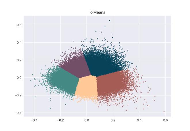
This data is generated by the entire database, the numbers are randomly selected userIds. With this information, I then perform a k-means clustering. However, it is essential to decide the numbers of clusters is suitable. With the help of the Elbow method, which tests different number of clusters to determine the best k by minimizing the centroid variance, I decided to cluster all datasets into five categories.
K-means is an algorithm for low dimensional clustering. Though it is not guaranteed optimal, it is relatively fast. The clustering results can be visualized as following by applying the entire dataset.
Analysis
In order to identify the clusters, I overlapped the random userId onto k-means.
With the given User ID, I would be able to retrieve the raw data of these users to identify their relationships.
Cluster Green: Action and Thriller I selected five of the users in cluster green and visualize them with a radar map. It is clear that this group of people have the preference and spend most of their time watching Action and Thriller movies. It is also true that Action, Thriller and Sci-Fi movies are often genres for the same movie.

Cluster Blue: Romance and Comedy with some drama I selected seven of the users in cluster blue and visualize them with a radar map. It is clear that this group of people have the preference and spend most of their time watching romance, drama and comedy movies. It is again true that these three genres are often identified in the same movie.

Cluster Red: Drama with a little Romance and Comedy I selected five of the users in cluster red and visualize them with a radar map. It is clear that this group of people have the preference and spend most of their time watching the drama. However, these drama movies include little romance and comedy movies.

Cluster Yellow: A little of Thriller, Mystery, Crime, Drama and Action I selected six of the users in cluster yellow and visualize them with a radar map. It is clear that this group of people have the preference and spend most of their time watching a little bit of thriller, mystery, crime, drama, and action. Again, this genre also goes well together for a single film.

Cluster Purple: A little bit of everything else I selected four of the users in cluster purple and visualize them with a radar map. It is clear that this group of people have preference across multiple categories and each with a very low percentage.

One of the most exciting thing from this cluster is cluster Red and Yellow. It shows that there are two large groups of users that are interested in Romance, Drama and Comedy, yet with different adjustments in proportion. It could be helpful for movie companies to piece together these elements when producing movies.
Here I demonstrated that through k-means, it is possible to identify clusters in the crowd that could assist in application development and recommendation systems for either users or movies. It also demonstrates possible combinations of films a company can produce. Of course, if there were more time, I might try to run PCA for three dimensions or perform a polynomial normalization before running k-means.
Conclusion #
In this brief report, I demonstrated data analysis on movie datasets from two aspects: observation and machine learning. Through data cleaning and table join operations, I was able to reveal some unexpected results for further analysis of the decrease in viewing populations. Through clustering machine learning, I was also able to cluster the users and identify the characteristics of each group.
Remarks #
The code for this project is now available on my GitHub. This project is built with python with major packages such as seaborn, matplotlib, numpy and sklearn used. The radar plots are drawn with Microsoft Excel.
[1] https://www.statista.com/statistics/271861/number-of-digital-cinema-screens-worldwide/ [2] https://grouplens.org/datasets/movielens/20m/ [3] https://movielens.org/ [4] http://files.grouplens.org/datasets/movielens/ml-20m-README.html